Graphic design trends to explore in 2024
As we continue our look into the trends that we’ll be seeing more of throughout 2024, it’s time to explore graphic design. Last year’s graphic design trends included minimalism, Y2K aesthetics, AI design and 3D simplicity. This year, things are cleaner, more natural, and just a little bit weirder.
3D design
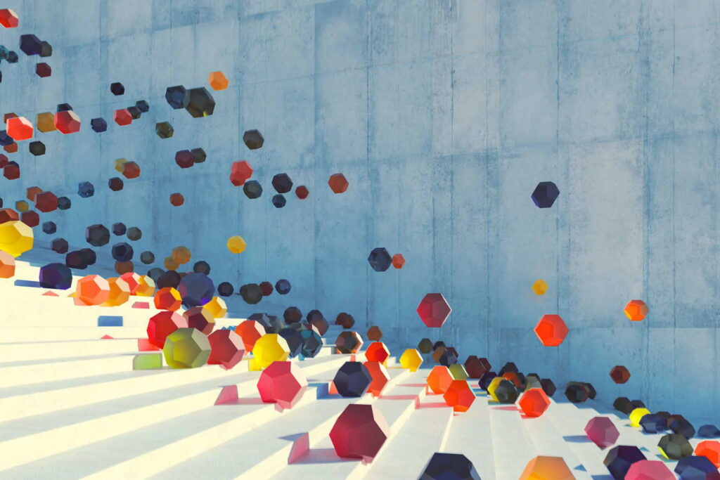
While last year saw 3D design focus on simplicity, with flat colours and basic shapes taking the spotlight, 2024 is looking to ramp things up in the third dimension.
As AI and other tools continue to make complex creations more accessible, we’re seeing two different strains of 3D art come into the forefront of design. For the inexperienced designer, these tools mean that custom 3D graphics aren’t the exclusive domain of brands with high budgets and huge teams of experts at their disposal. Smaller teams are now better able to showcase their creativity and stand shoulder-to-shoulder with brands that previously felt unattainable.
Of course, these technological advances are also a great boon for experienced designers that are capable of creating something incredible from the most rudimentary of tools. This allows them to test the boundaries of what’s possible and create increasingly impressive 3D graphics on a level we’ve not seen before. From mocking up photo-realistic concept art to animating complex scenes, 3D art is more innovative and exciting than ever.
Pixelation
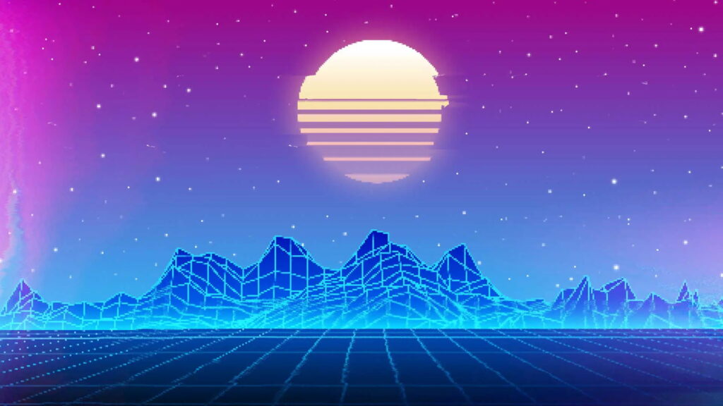
There’s something comforting yet compelling about pixel art, evoking nostalgia for the simpler days of technology.
This stripped back aesthetic can be clean, playful or completely bonkers, depending on the direction you take it, which makes it a super versatile choice. Channel the 1970s with a monochromatic palette, or throw a whole bunch of colours and textures at it for a mind-blowing, glitchy vibe.
Pixel art is a fun way to create memorable characters and designs. The limitations of the block-based format pose a fascinating challenge that forces designers to think outside the box (no pun intended). To really embrace the aesthetic, opt for an 8-bit or 16-bit design, and try to stick to a limited colour palette. Using your main brand colours is a great way to make your mark in pixel form.
While appearing limited in its blocky form, pixelation actually offers endless possibilities for design. It’s about more than just creating images from tiny squares; pixel-based fonts, photo grids and boxy layouts all contribute to the vibe without the need to rip off kitsch video game graphics.
Serif fonts
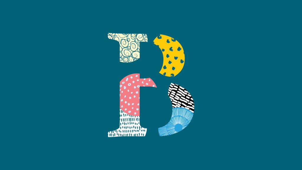
In 2019, getting rid of serifs was all the rage. In particular, we saw a whole host of luxury brands ditch their historic logos in favour of stark, all-caps wordmarks in sans serif fonts. This year, however, serifs are back in vogue.
So much of modern design, particularly online, has become clean, stark and almost without character. By embracing the serif, brands can adopt a more playful tone, evoke sincerity and seriousness, or go all-out with something truly unique – as long as it’s still legible!
Serif fonts can evoke a sense of trust and maturity (think classic Times New Roman), or they can be exaggerated to create something more whimsical (Goudy Stout, anyone?). Whether as part of a logo, print typography or website design, the distinctiveness and visual appeal of serif fonts helps to make a brand stand out.
Surrealism
Times are tough and the world can be scary, and the internet is a great place for a little escapism and mindless distraction.
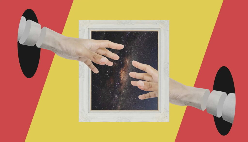
This is probably why surrealist vibes have been gaining more traction in graphic design, offering something completely new and unique that consumers can’t get in the real world. It’s hard to make waves in the oversaturated content market, but completely bonkers designs are almost guaranteed to get you noticed (though perhaps not for the right reasons).
As I see it, there are two main schools of surrealist graphic design. The first channels the 20th-century art movement, where artists like Dalí and Magritte juxtaposed the normal with the abnormal, creating brand-new contexts for familiar imagery. The second channels the bizarre memes favoured by Gen Z, where WordArt and internet humour combine to create utter nonsense that is somehow devastatingly captivating.
Whichever you choose, the freedom of combining concepts in a unique way can help to shake the cobwebs loose and unearth something truly unique.
Need some graphic design support in 2024?
DWH is a branding agency with decades of experience in graphic design, so we have the in-depth insights needed to make the most out of your brand. While we love to follow the latest trends, we also understand when and how they’re best employed. We’ll never force you to jump on the bandwagon if we don’t believe it’s in the best interest of your brand.
If you’d like to add an expert touch to your graphic design strategy, get in touch and we’ll be happy to help.
+ 44 (0)24 7518 5490
[email protected]
Friars House, Manor House Drive, Coventry CV1 2TE
Company Profile
+ 44 (0)24 7518 5490
[email protected]
Friars House, Manor House Drive, Coventry CV1 2TE
MCH HUBS
RECENT ARTICLES


